Role
Designer & engineer
A designer’s resume that passes ATS parsing and tailors itself to each job posting, without re-editing the source file.
The resume is designed in InDesign and kept as a single HTML file: structured content in reading order, with the visual design and layout translated into CSS. Every application starts from that master. The pipeline adds the posting’s missing/alternate keywords to the Skills line, swaps in the matching profile summary, and renders a PDF that keeps the design intact and parses cleanly. It runs as part of Pharos, my job search tool.
None of this is new. Screen readers taught us reading order, real headings and real text back in 2005, and then we let it slide. Except now a whole throng of blind robots reads every resume, and the cold judgement of a machine is the one we can’t ignore.
A resume designed in InDesign looks great to people and like a ransom note to an ATS, and the standard advice is to make it boring, which I declined with colourful words.
Problem one is that a resume designed in InDesign or Figma looks great to humans and like a ransom note to an ATS. Mine came out of the parser as “VLADIMIRLUKIC,” with every section heading stacked at the top and nothing under any of them, and the internet’s advice for that is to make your resume as boring as humanly possible so a parser older than your phone can read it, after which Workday makes you type the whole thing into its forms anyway. Most people go with boring, but that was a pill I refused to swallow, my very own There! Are! Four! Lights! moment for the nerdy elder millennials in the back.
Problem two is that every posting wants a slightly different version of me, and tailoring meant reopening the design file, editing the text by hand and exporting a new PDF for every application. A design file is a great place to design a resume once, and a terrible place to keep rewriting yourself for strangers.
The fix is an old idea: keep the structure and the styling apart. The content lives in semantic markup, in reading order, with every heading, role and date tagged for what it is, and the design is applied on top as a separate layer of styles. That was the whole premise of the CSS Zen Garden, where designers restyled one shared HTML page using nothing but CSS, and my 2005 entry, Angelus, is below, with its stylesheet and without.
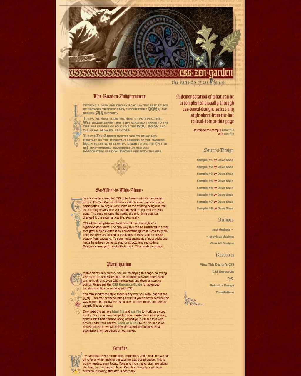
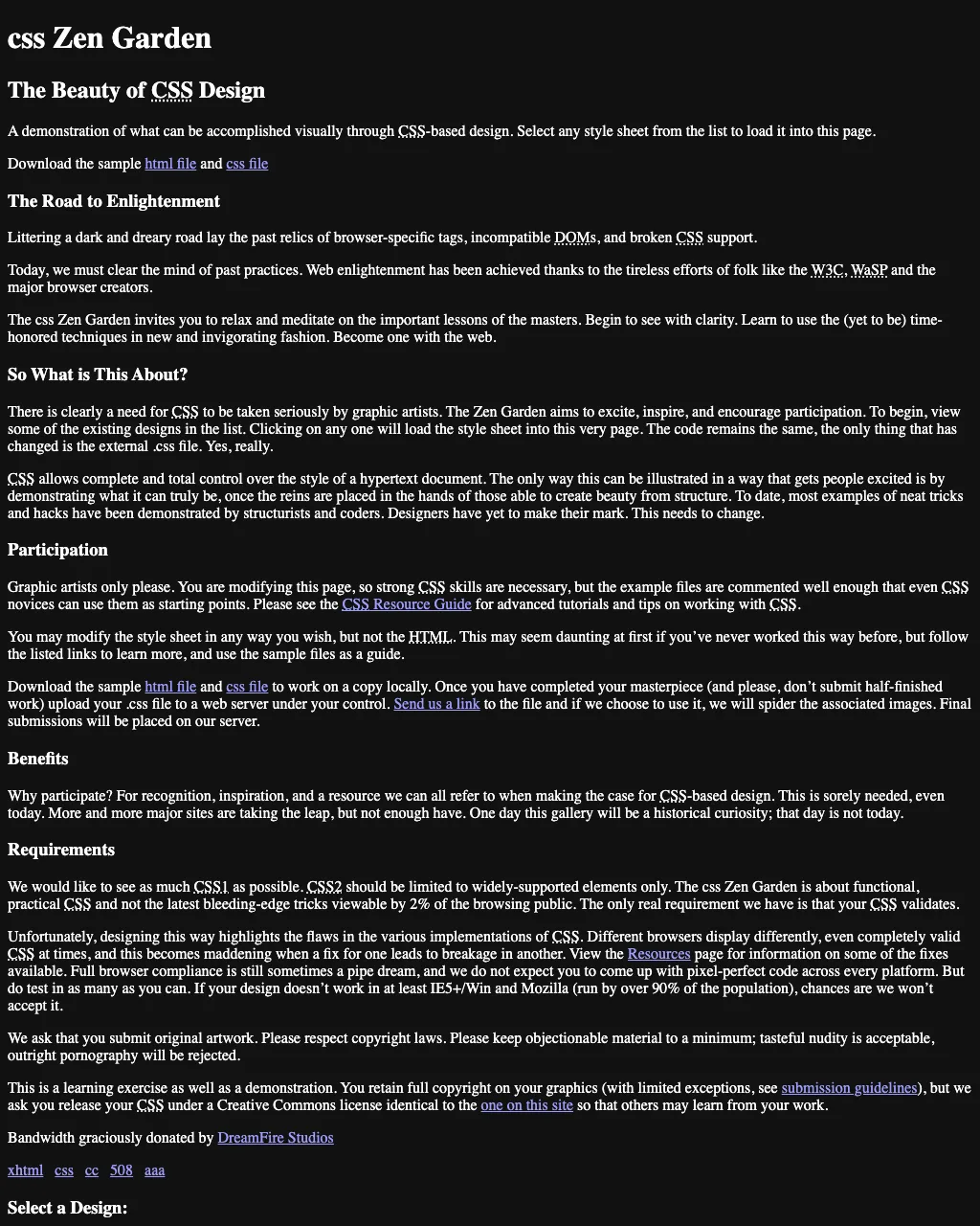
Much like tailoring bespoke clothes, designing a resume that looks good and is well made for the modern ATS requires building on the fundamental patterns that stood the test of time.
The resume lives as one HTML file. The content comes first, in reading order, top to bottom: headings, roles, dates, bullets, all as plain text. The visual design, translated from my InDesign layout, is then applied to the structure and content, and the colours, type, leading, rules and margins match the original. Everything lives in one machine-editable file, and any subsequent processing (e.g. a PDF export) is a non-issue.
When Pharos finds a posting worth applying to, it reads the job description and works on a copy of that file. If there are any keywords that happen to be variant spellings or other ATS annoyances, it’ll match, so a robot on the other end doesn’t get confused. It swaps in the profile summary that fits the role, and it tags the portfolio link with the company’s name, so I know who clicked through.
Then the HTML renders to PDF. Same layout every time; only the words change.
From there, the rest is housekeeping I don’t have to do. The PDF gets named after the company and the role ({Company} - {Role}_Vladimir_Lukic_Resume.pdf) and saved to my Resumes folder, ready to attach, while Pharos records which file belongs to which posting, along with the ATS match before and after tailoring, and skips any posting it has already done unless something changed. When my own content changes, like a new role or a sharper summary, I tell Claude and it edits the master, so every PDF after that carries the update. By the time I sit down to apply, the resumes are waiting.
AI handles the conversion and the production, but it does so from a properly woven resume template that never cuts corners on visual quality for the sake of ATS‑minimalist fashion trends.
The conversion is the machine’s job. Setting up the design file properly is the designer’s, and the better that file is built, the less there is to fix later. You only cry once: the care goes in up front, instead of into every resume. Whatever the tool, the file needs four things.
One story, in reading order. The text runs through the document in the order a person, or a parser, should read it. In InDesign that means threaded text frames, checked in the Story Editor. In Figma, layer and auto-layout order does the same job.
Styles named for what they are. Section heading, role title, role meta, body. Not “Paragraph Style 1” or “Character Style 3,” the defaults that tell a converter nothing. The style names become the tags and classes in the HTML, so they have to mean something.
Design values stored as styles, swatches or variables. Those become the tokens in the CSS. Anything set by hand as a one-off override comes through hardcoded and has to be cleaned up afterwards.
Real text for anything a parser has to read. My old PDFs parsed my name as “VLADIMIRLUKIC.” The master keeps the logo as art and carries the name as real text (as an H1, for example).
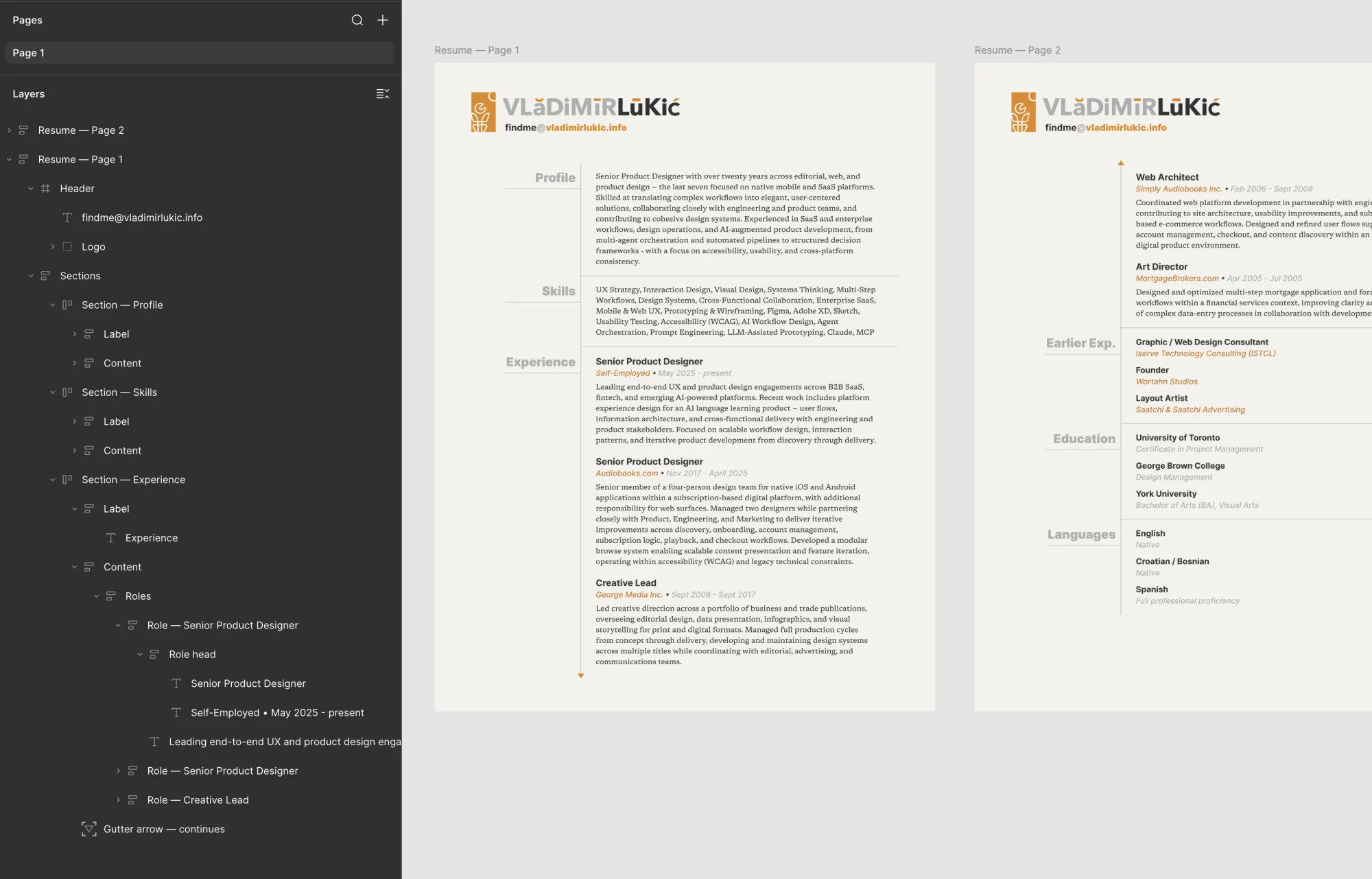
None of this is tied to InDesign. Here’s the same resume set up in Figma: every section is a named frame with its label beside its content, nested in reading order with auto-layout, and the type and colours are text styles and variables rather than one-off values. Read through Figma’s MCP, that structure is exactly what Claude converts.
Resume — Page
├── Header
│   ├── Logo
│   └── Email
└── Sections
    └── Section — {name}
        ├── Label
        ├── Content
        │   └── Roles
        │       └── Role
        │           ├── Role head
        │           │   ├── Title
        │           │   └── Company • Dates
        │           └── Description
└── Gutter arrow (ornament, no text)Ornaments are a separate layer. The gutter line and the little continuation arrows on my resume carry no text, so a parser skips right past them. It’s the same idea as the empty extra elements the Zen Garden gave designers to hang decoration on, and in the HTML they’re pure CSS, with no markup at all.
From there, the InDesign file goes out as IDML, a zip of XML holding the styles, the stories and the geometry, and Claude parses it into the HTML master and its CSS. What’s left for me is the last few pixels: a heading sitting two points low, an arrow getting clipped. That’s a far better job than figuring out why half the resume fell off the page.
What comes out is a template for label-and-content resumes, with section names in a narrow column down the left, and it extends section by section: Languages on my second page is just the Education pattern reused. Two columns are fine as presentation, but underneath, the document still has to read as one flat column, top to bottom. Ornament doesn’t break the conversion, as long as the content underneath is structured properly; it just becomes extra work, rebuilt one piece at a time. So save yourself the trouble and lean on typography more than punk rock zine aesthetics, no matter how cool.
Tailoring a resume now takes seconds, and every PDF still parses cleanly without being torn apart at the seams.
Tailoring a resume takes seconds per posting, and doesn’t take years off my life whenever I have to change Design Systems to System Design so the ATS doesn’t have a stroke. Every PDF parses clean: run pdftotext on it and the resume comes back in order, top to bottom. And the design decisions stay mine, as they should, but never become the stumbling block or a compromise of taste and skill for the sake of automation.